
On the surface both $GME and $AMC seem to be following the same formula. Distressed stocks and companies seemingly on the path towards bankruptcy with hedge funds and market makers heavily shorting and naked shorting them helping them to get there. The meme stock craze in 2021 then brings them new life and now you have hordes of retail traders betting on the stock and underlying companies to succeed, with major battles now playing out between the bulls versus the bears.
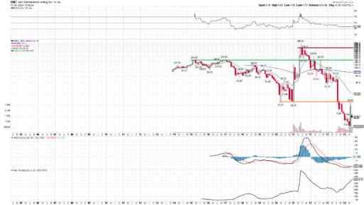
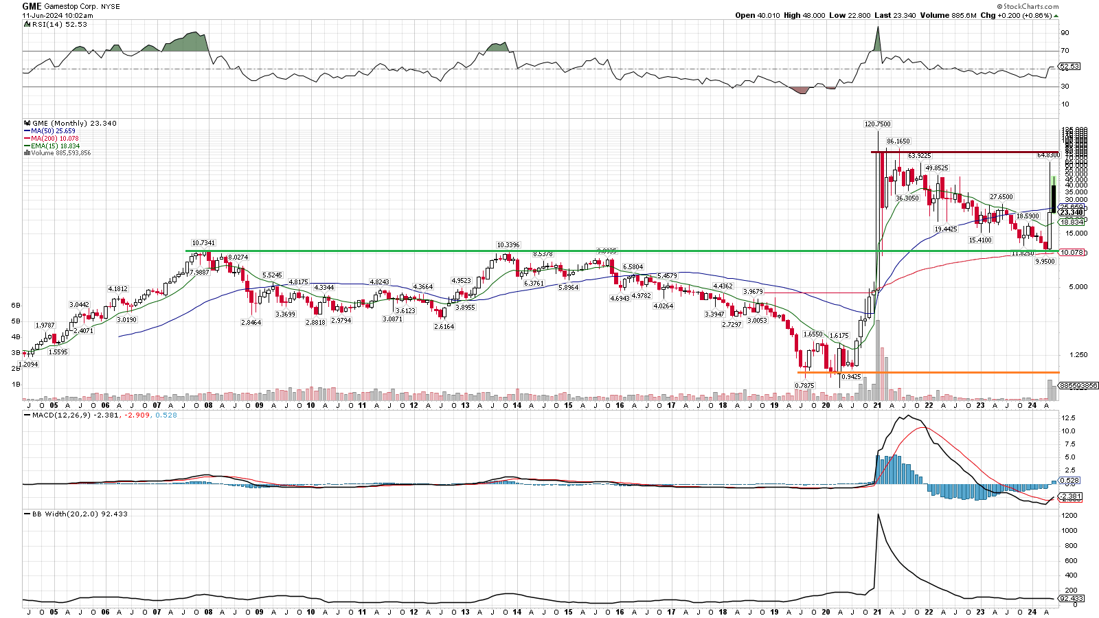
The charts are where the similarities end and to understand the difference between them is to understand what this Special Event Theory is and why I think it’s special. Let’s start by looking at the 20 year charts for both $GME and $AMC and pay note to the three lines I drew on them.
- Red line: Secular ceiling level
- Green line: Secular ceiling prior to 2021’s bull market
- Orange line: Secular floor before 2021

The significance to the SET chart pattern is in the secular strength, potential secular strength, or at minimum the lack of overwhelming secular weakness it represents. The stronger the cycles are trending on the wider time frames, the more energy and momentum is currently favoring the bulls. When it comes to shorts battling it out versus longs, the chart and the trends on the chart are a very objective way to determine which side (if any) is winning.
The pattern we’re looking for is a long base and then a breakout to new secular highs. That’s the green line, and you can see both stocks made that jump in 2021. The red line then marks where the ceiling was on those rallies, and now marks the new secular ceiling we’re aiming for. The green line, ie the old ceiling, in theory should now become a new floor. You can see that $GME indeed made that old ceiling it’s new floor, which is victory for the bulls which is hard to overstate. That is proof that the 2021 ‘craze’ wasn’t just a craze, it was the beginning of a big time shift in energy (and likely fundamentals).
$AMC on the other hand fell through it’s green line, ie the ceiling never became a floor and instead turned right back into a ceiling. If that wasn’t bad enough, the pre 2021 floor (orange line) ended up being broken and has now been turned into another ceiling! I say this with no bias whatsoever, this chart is telling me the bears/shorts are winning this battle against $AMC bulls/longs.
If you get nothing else from my theories, just appreciate this statement. The chart is the score keeper and it’s the backbone of why I’m bullish on many of these shells and $GME (and not $AMC). The strong secular trends are reflections of underlying strength and momentum in the bulls favor which have a good chance of leading to further buying pressure. The strength in the buying pressure will further help the legitimate growth and turnaround stories succeed.
The antithesis to the the SET pattern is the perpetually downtrending toxic diluting OTC charts you historically see, where old floors become the new ceiling over and over again. Just like what we’re seeing on $AMC. That isn’t to say it can’t have some rallies of it’s own, especially in sympathy to any $GME strength, but the odds seem overwhelming to me that it will continue it’s trend of lower highs and lower lows while $GME is proving to the market that it’s doing the exact opposite of that. If these charts are essentially keeping score of their respective battles, which side do you feel comfortable betting on?